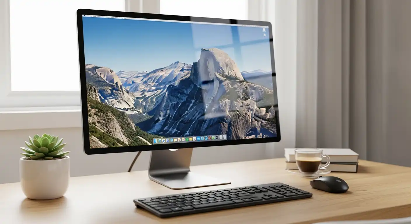
For a content creator, the monitor is not merely a peripheral; it is the canvas upon which your vision comes to life. Whether you are a photographer, a video editor, a graphic designer, or a 3D artist, your display acts as the window into your work. If that window is tinted, warped, or blurry, your final product will suffer.
Imagine spending hours color-grading a video or retouching a portrait, only to view it on a different screen and realize the skin tones are green, or the shadows are crushed. This is the nightmare scenario that a professional-grade monitor prevents. Unlike gaming monitors, which prioritize speed and refresh rates, or general office monitors, which prioritize text legibility and cost, content creation monitors focus on one singular goal: fidelity.
Navigating the market of professional displays can be overwhelming. The spec sheets are filled with acronyms like Delta E, Rec.709, LUTs, and Nits. This comprehensive guide will strip away the marketing jargon and explain exactly what you need to look for to ensure that what you see on your screen is exactly what your audience sees on theirs.
The Foundation: Panel Technology
The physical technology used to build the screen dictates its viewing angles, contrast ratios, and color reproduction capabilities. Choosing the wrong panel type is the most common mistake creators make.
In-Plane Switching (IPS)
For the vast majority of content creators, IPS is the gold standard. IPS panels are renowned for their superior color accuracy and, crucially, their wide viewing angles. When you look at an IPS screen from the side, the colors do not shift or invert. This is vital for designers who might shift in their chair or collaborate with a colleague sitting next to them.
Within the IPS category, look for newer variations like IPS Black. Traditional IPS panels struggle with contrast (blacks can look like dark grey). IPS Black technology doubles the contrast ratio of standard IPS panels, offering deeper blacks while maintaining that critical color accuracy.
OLED and Mini-LED
OLED (Organic Light-Emitting Diode) is the new heavyweight champion for contrast. Because each pixel is self-lit, blacks are truly black (the pixel simply turns off). This results in infinite contrast ratios, making them incredible for video editors working in HDR (High Dynamic Range). However, OLEDs carry a risk of “burn-in” if static UI elements (like the Photoshop toolbar) are left on screen for thousands of hours.
Mini-LED is a middle ground. It uses an LCD panel (usually IPS) but with thousands of tiny LEDs behind it for backlighting. This allows for incredible brightness and local dimming, rivaling OLED for HDR work without the burn-in risk.
Why You Should Avoid TN and VA Panels
TN (Twisted Nematic) panels are cheap and fast, making them popular for budget gaming, but they have horrendous color reproduction and viewing angles. If you tilt your head, the image changes. Avoid these at all costs.
VA (Vertical Alignment) panels offer great contrast but suffer from “gamma shift.” This means colors in the center of the screen look different than colors at the edges because of the angle at which you are viewing them. For color-critical work, this inconsistency is unacceptable.
Resolution and Screen Real Estate
Resolution determines how sharp your image is and how much workspace you have. In the creative world, more pixels usually mean more productivity, but there is a point of diminishing returns.
The Sweet Spot: 4K (UHD)
For a standard 27-inch or 32-inch monitor, 4K (3840 x 2160) is the current professional standard. A 4K monitor allows video editors to view full 1080p or even 4K footage at full resolution while still having room for timelines and tool palettes. For photographers, the high pixel density (PPI) allows for precise retouching without constantly zooming in and out.
1440p (QHD) vs. 5K/6K
If you are on a strict budget, a 27-inch 1440p monitor is the absolute minimum entry point. It offers decent sharpness, but you will feel the lack of space compared to 4K.
On the high end, 5K and 6K monitors (popularized by Apple’s displays) offer incredibly high pixel density. This produces a “retina” look where pixels are invisible to the naked eye. While luxurious and excellent for text sharpness, they demand powerful graphics cards to drive them smoothly.
Ultrawide vs. Dual Monitors
Ultrawide monitors (21:9 aspect ratio) are gaining popularity among video editors. The extra horizontal space allows for a massively long timeline in software like Adobe Premiere Pro or DaVinci Resolve without the bezel gap of a dual-monitor setup.
However, keep in mind that most video content is consumed in 16:9. If you edit on an ultrawide, you will have black bars on the sides of your preview window, or you might misjudge how the video feels on a standard television.
Mastering Color Science: Gamut and Accuracy
This is the most technical and critical section. If a monitor cannot display the colors you are trying to use, you are effectively flying blind.
Understanding Color Gamuts
A color gamut is the range of colors a monitor can reproduce. Different creative fields require different gamuts:
- sRGB: The standard for the web. If you design websites, social media graphics, or digital ads, your monitor must cover 99-100% of the sRGB spectrum.
- Adobe RGB: This gamut is wider than sRGB, specifically in the green and cyan regions. This is the standard for professional printing. If you are a photographer whose work ends up in magazines or fine art prints, you need a monitor that covers at least 98% of Adobe RGB.
- DCI-P3: The standard for digital cinema and high-end mobile devices (like iPhones). Video editors and motion designers should aim for 95% or higher coverage of DCI-P3.
Delta E: Measuring Accuracy
Coverage isn’t enough; the monitor must also be accurate. This is measured by Delta E (ΔE). This figure represents the difference between the “true” color and the color displayed by the monitor.
- Delta E < 2: The difference is indistinguishable to the human eye. This is the target for professional monitors.
- Delta E > 3: Trained eyes can spot the error.
- Delta E > 5: The color is noticeably wrong.
Look for monitors that come “Factory Calibrated” with a report guaranteeing a Delta E of less than 2.
Bit Depth: 8-bit vs. 10-bit
Bit depth refers to the number of colors a panel can display.
- 8-bit: Displays 16.7 million colors. Standard for most monitors.
- 10-bit: Displays 1.07 billion colors.
For standard web design, 8-bit is fine. However, if you are working with gradients, skies in photography, or high-end video, 8-bit panels can result in “banding” (visible steps between shades of color). A true 10-bit panel (or an 8-bit + FRC panel) smoothens these gradients perfectly.
Brightness, HDR, and Uniformity
Brightness is measured in Nits (candelas per square meter). A standard office monitor is around 250 nits. For content creation in a brightly lit room, you want at least 350-400 nits.
The HDR Landscape
High Dynamic Range (HDR) is becoming a requirement for video editors. However, be successfully wary of the “HDR400” label found on cheap monitors. This basically means the monitor can accept an HDR signal, but it lacks the hardware to display it properly.
To truly edit HDR content, you need:
- Peak Brightness: At least 600 nits, preferably 1000 nits.
- Local Dimming: The ability to darken specific zones of the screen while keeping others bright. Without this, HDR looks washed out.
Screen Uniformity
A common flaw in lower-end large monitors is poor uniformity. This looks like a vignette effect, where the corners are darker than the center, or one side of the screen has a warm (yellow) tint while the other is cool (blue). Higher-end monitors (like the Eizo ColorEdge or ASUS ProArt series) have internal circuitry specifically designed to compensate for uniformity errors across the panel.
Ergonomics and Connectivity
Your workflow efficiency is dictated by how well the monitor integrates with your workspace.
USB-C and Thunderbolt 3/4
For users of modern laptops (especially MacBooks), a monitor with USB-C or Thunderbolt connectivity is a game-changer. These ports can carry video signals, data, and power (Power Delivery) all through a single cable.
- Power Delivery (PD): Check the wattage. If you have a powerful laptop, you need a monitor that delivers at least 65W or 90W of power to charge your laptop while you work.
KVM Switches
If you use both a desktop PC and a laptop, look for a monitor with a built-in KVM (Keyboard, Video, Mouse) switch. This allows you to plug your keyboard and mouse into the monitor and control two different computers, switching between them with the push of a button.
Matte vs. Glossy Finish
- Matte: Diffuses reflections. It is generally preferred for color-critical work because it ensures you are seeing the pixels, not the reflection of the window behind you.
- Glossy: Makes colors “pop” and blacks look deeper, but reflections can be a nightmare in uncontrolled lighting environments.
Matching the Monitor to Your Niche
Not all content creators need the same specs. Here is how to prioritize based on your specific job.
For Photographers and Print Designers
Priority: Color Gamut (Adobe RGB) and Uniformity.
You need to trust that the print will match the screen. High contrast is less important than perfect color linearity. A monitor hood (a visor that blocks ambient light) is a valuable accessory often included with photographer-specific monitors to preventing glare from skewing your perception of contrast.
For Video Editors and Colorists
Priority: Contrast Ratio, DCI-P3 Gamut, and 10-bit Color.
You are dealing with moving images and often working in dark rooms. Contrast is king here. If you are grading HDR footage, you must invest in Mini-LED or OLED technology. Resolution is also key; a 4K monitor allows for a 1:1 pixel preview of 4K footage.
For Game Developers and 3D Artists
Priority: Refresh Rate and Response Time mixed with Color Accuracy.
Unlike video editors, game devs need to know how the game feels. A standard 60Hz monitor might be too slow to test fluid gameplay mechanics. Look for “Creator” monitors that offer 120Hz or 144Hz refresh rates while maintaining solid sRGB/DCI-P3 coverage. You may have to sacrifice a tiny bit of color perfection for motion clarity.
For Graphic Designers (Web/UI/UX)
Priority: Crispness and sRGB Coverage.
You don’t need Adobe RGB because your work lives on screens. However, you need sRGB perfection. 4K resolution is highly recommended to ensure your typography and vector lines are razor-sharp.
The Importance of Hardware Calibration
Here is a hard truth: All monitors drift over time. As the backlight ages, the colors shift. The “factory calibration” that came with your monitor is only valid for the first few months.
To maintain professional standards, you must invest in a Colorimeter (like the Calibrite Display Plus or Datacolor Spyder).
- Software Calibration: The colorimeter measures the screen and adjusts the graphics card output to correct errors.
- Hardware Calibration: Found on high-end monitors (BenQ SW series, Eizo, Dell UltraSharp PremierColor). The calibration LUT (Look-Up Table) is stored inside the monitor itself, not the computer. This provides significantly smoother gradients and more accurate results.
Some top-tier monitors even have built-in pop-up colorimeters that automatically calibrate the screen on a schedule you set.
Budgeting: Where to Spend and Where to Save
Monitor pricing is not linear; the law of diminishing returns applies heavily.
Entry-Level ($300 – $500)
At this price point, look for 27-inch 4K IPS panels from brands like Dell (S-series), LG, or ASUS.
- What you get: Good sRGB coverage, decent sharpness.
- What you lose: Adobe RGB coverage, hardware calibration, uniformity correction, HDR capability.
Mid-Range ($600 – $1,200)
This is the sweet spot for most freelancers. Look at the ASUS ProArt line, Dell UltraSharp, or BenQ PD/SW series.
- What you get: 98%+ DCI-P3/Adobe RGB, Factory calibration reports, USB-C hubs, better build quality, entry-level HDR.
High-End Professional ($2,000 – $5,000+)
This includes brands like Eizo, Flanders Scientific, and Apple’s Pro Display XDR.
- What you get: Perfect uniformity, true hardware calibration, built-in sensors, true HDR reference mastering capabilities. These are for production houses where a single color mistake could cost thousands of dollars.
Conclusion
Selecting the best monitor for content creation is an exercise in honesty about your workflow. Do not buy an Adobe RGB monitor if you only design for the web. Do not buy a 60Hz panel if you are developing a fast-paced shooter game. And do not buy a “fake” HDR monitor expecting to grade Netflix-quality footage.
Remember that your monitor is a long-term investment. While computers and cameras become obsolete every few years, a high-quality monitor can serve you faithfully for a decade. It is the lens through which you judge your own skill and the interface through which you present your work to the world.
Prioritize panel type (IPS or OLED), ensure the resolution matches your screen size (4K at 27-inch+), and demand verified color accuracy (Delta E < 2). Once you make the switch to a professional display, you will realize that you weren’t just looking at your work before—you were looking past it. The right monitor brings your creation into focus, ensuring that the vision in your mind is exactly what appears on the screen.